ZeepUp Visual Brand Bible V0.4
Visual Brand Bible / V0.4 / September 2026

Italian food culture × retro hospitality × modern tech.

A visual system built around real people, real food and useful discovery. White space keeps it fresh. Pink signals action. Butter brings warmth.

PERSONFOODDETAILSACTION →
ZEEPUP VISUAL BRAND BIBLE / V0.4
Official ZeepUp wordmark
ZeepUp app icon
One distinctive wordmark.
One simple app signal.
Use approved master assets only.
01
Brand idea

Human before technological.

ZeepUp should feel warm without becoming nostalgic, and contemporary without becoming cold. The visual system makes one idea obvious: there is a person behind the food, and technology makes that person easier to discover.

Warm

Real people.

Lived-in kitchens, tactile food, hospitality.

Cool

Cultural confidence.

Bold type, editorial composition and a clear point of view.

Tech

Useful, not cold.

Location, distance, time, availability and clear action.

Core principle: Human first. Food at the heart. Tech makes the connection useful.
01B
Brand principles

One idea. Two ways to say it.

Use the internal principle to guide brand decisions. Use the external expression when ZeepUp speaks to consumers.

Internal brand principle

Human first.
Food at the heart.
Tech makes the connection useful.

Our decision filter. People create the trust, food creates the desire, and technology removes friction from discovery.

External expression

Great food starts with people.
Tech helps you discover them.

Our clearest consumer-facing expression: start with the person behind the food, then show how ZeepUp makes them easier to find.

Hierarchy: Person → Food → Useful technology. Never lead with technology for its own sake.
02
Reference territory

Use ingredients, not identities.

Build a mix that feels recognisably ZeepUp. References guide the tension; they are not templates to copy.

70%

AutoCamp / Mollie’s

Hospitality structure. Retro warmth. Confident wayfinding.

20%

Ace / Resy

Editorial culture. People. Food as a scene.

10%

Nothing

Precision. Utility labels. Controlled tech tension.

Visual tension to protect: Warm hospitality × crisp digital utility.
02B
Current visual DNA

Keep the energy. Give it a system.

The current ZeepUp assets already contain useful ingredients: light, lifestyle, sophistication, energy and a strong pink point of view. V0.6 keeps that DNA, but makes it more recognisable and more useful.

KeepLight. Bright, sun-washed images and generous white space.
KeepLifestyle. Food in a real human context, not isolated product photography only.
KeepEnergy + fun. Unexpected crops, gestures and a little irreverence.
KeepSophistication. Editorial restraint rather than generic social templates.
EvolveThe Future Is Pink. Pink remains the distinctive signal — but action, icons and key highlights should carry it instead of whole layouts becoming pink.
Warm outdoor family food scene from current ZeepUp assetsHOSPITALITY / HUMAN
Bright food still life from current ZeepUp assetsLIGHT / FOOD
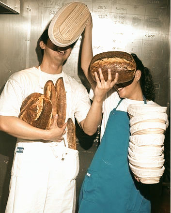
Playful bread scene from current ZeepUp assetsENERGY / PEOPLE
Warm meal scene from current ZeepUp assetsLIFESTYLE / WARMTH
01 / IMAGEBright, warm, real.
02 / SPACEWhite gives the food air.
03 / SIGNALPink tells you where to look.
04 / WARMTHButter is a supporting accent.
05 / UTILITYData earns its place.

Use the current /assets imagery as a source of visual continuity, not as a fixed template. New shoots should follow the photography rules below.

03
Colour system

Four colours. Each one has a job.

White is the page. Colour is functional. The percentages are a usage guide, not a mathematical rule.

White
#FFFFFF
45–60%
Base / Space
Background / breathing room
Charcoal
#191919
20–30%
Structure / Type
Text / structure / anchors
Zeep Pink
#FF0066
5–10%
Action / Signal
CTA / action / signal
Butter Yellow
#FFF493
10–20%
Warmth / Support
Warmth / app accent
Production note: Butter Yellow is locked at #FFF493. Olive and tan are not core brand colours; let those tones occur naturally in photography.
04
Typography

Personality in the logo. Clarity in the type.

A two-font system: one human/editorial voice and one precise utility voice.

Primary brand typeface

Instrument Sans

Use for headlines, body copy, navigation, captions and buttons. It should carry almost all brand language.

Meet who cooks
near you.
Utility typeface

IBM Plex Mono

Use only for factual micro-data and product-like labels. It brings the tech layer without making the brand feel cold.

TODAY1.2 KMEAT-IN4 PLACES
Display / Headlines

Instrument Sans 700–800

Large, confident, sentence case. Tight tracking. One dominant message per frame.

Body / Editorial

Instrument Sans 400–500

Short paragraphs, generous line spacing, natural sentence case. Keep it warm and readable.

Nav / Buttons

Instrument Sans 600–700

Compact and direct. Uppercase is fine for small UI labels and CTAs, but do not overuse it in prose.

Micro-data

IBM Plex Mono 500–600

TODAY · 1.2 KM · EAT-IN · 4 PLACES

Never use the mono font for long copy or emotional headlines.

Logo rule: the ZeepUp wordmark is an asset, not a font treatment. Never recreate it by typing the name in Instrument Sans.
Status: Instrument Sans remains the recommended primary direction until the final web/social/app test is signed off.
06
Photography

Bright, warm and lived-in — never moody.

Real cooks. Real food. Real places. The retro feeling comes from composition, grain and warmth — not from underexposure.

Playful food makersPERSON
Bright brownie food sceneFOOD
Shared table hospitalityHOSPITALITY
Warm human dining sceneLIFESTYLE
LightNatural daylight. Warm highlights. Soft contrast. Slightly lifted shadows.
ColourHonest skin and food tones. Restrained saturation. No heavy brown cast.
TextureA touch of filmic grain is welcome. Food should feel tactile and immediate.
AvoidStock chef portraits, sterile kitchens, white-toque brochures, luxury food porn with no person or context.
07
Graphic grammar

Human content + useful data = the ZeepUp signature.

MILAN / ISOLA
GIULIA

Fresh pasta
for six tonight.

TODAY1.2 KMEAT-IN4 PLACES
Discover
Food and hospitality visual

Repeat this logic across website, Reel covers, Stories, carousels and paid ads. It should become a recognisable piece of brand behaviour — the ZeepUp equivalent of a booking bar.

The signal: WHO COOKS × WHAT THEY MAKE × WHERE × TODAY.
08
Layout system

Asymmetric. Roomy. Editorial.

Use contrast in scale, generous whitespace and functional information blocks. The grid should organise the page without making it feel rigid.

One dominant message per frame
12-column logic, not 12 equal boxes
Generous outer margins
Functional modules sit on the grid
Dark bars can anchor information
Pink only signals action
Butter adds warmth, never clutter
MILAN / ISOLA
ANNA

Ravioli made
by hand tonight.

TODAY1.2 KMEAT-IN4
Discover
Food crop demonstrating asymmetric editorial layout
09
Social — B2C

Three repeatable consumer formats.

Repeat the formats until they feel like ZeepUp. These are not three visual templates. They are three editorial jobs. A creator should know which job the post is doing before designing it.

01

Meet the Cook

Build trust through the person behind the food.
When to use
When introducing a new Chef/HomeChef or telling a personal story.
Must include
Face or hands, name, location, what they are known for.
PERSON FIRST.
02

What’s Cooking

Create appetite and make the offer tangible.
When to use
For a menu, dish, drop, availability or limited quantity.
Must include
Food, what it is, when, Eat-In/To-Go, availability.
FOOD FIRST.
03

Discover Near You

Build the habit of opening ZeepUp to see what is around.
When to use
For location, variety, neighbourhood discovery and “today”.
Must include
Place/map cue, nearby options, useful micro-data.
UTILITY FIRST.
10
Social — B2C examples

Same brand. Three different reasons to post.

Food makersMEET THE COOK

Meet the person before the menu.

Identity first: show the cook, their gesture and what they are known for.

MILAN1.4 KMEAT-INTODAY
Discover
Food detailWHAT’S COOKING

Make the food impossible to ignore.

Food first: name it, say when, then show availability.

TONIGHTTO-GO4 PORTIONS
View menu
What’s good near you?
DISCOVER NEAR YOU

Turn location into a habit.

Utility first: map cue, nearby options and only the data that helps discovery.

TODAY1.0 KM3 COOKS
Open map
11
Social — B2B

Recruitment that looks like culture, not HR.

For cold audiences, lead with identity or possibility. Reel-first acquisition. The first reaction should be “that could be me”, not “here are the platform features”. Stories and carousels are mainly for retargeting, FAQs and completion.

ACQUISITION

YOU CAN COOK.
But who knows?

Join ZeepUp
TALENT

WHAT IS THE DISH
everyone asks you for?

Create your profile
PROOF

YOU COOK.
We help people find you.

Join ZeepUp
12
Website + app

Let the website prove value before asking for the download.

Hero → Map → Intent → App.
01

Hero

EXPLORE WHAT’S GOOD TODAY. Scrolls to the map. Do not imply the website can complete the booking.

02

Map

Show real discovery: people, dishes, location and availability.

03

Intent

The user finds something they actually want to eat or book.

04

App

OPEN IN ZEEPUP. Explain that booking and ordering happen in the app.

Visual rule: White field + phone proof + charcoal utility bar + pink action. Butter may support small warm moments.
13
Motion + Reels

Person → Food → Details → Action.

The rhythm should be fast enough for tech, but slow enough for food to feel tactile.

0–2S

Person

Meet who is cooking.

2–5S

Food

Make me want it.

5–8S

Details

Today / distance / availability.

8–12S

Action

Discover / join / open.

Cuts can be clean and quick. Use real kitchen sound. Text must always work without audio.
14
Utility, not decoration

Every graphic element should tell you something.

The tech layer is not visual garnish. It exists to reduce uncertainty and make discovery useful.

Location

Where

Distance

How far

Time

When

Eat-In

Experience

To-Go

Take away

4

Availability

How many

IF IT DOESN’T HELP DISCOVERY, IT DOESN’T NEED TO BE THERE.
15
Iconography + UI details

Pink by default. Functional always.

Yes: Zeep Pink should be the recognisable default for ZeepUp utility icons on white. It links the icon system to discovery and action without turning the whole layout pink.

Pin
Clock
Person
Bag
Plate
Heart
Chat
Chef
Default on white

Zeep Pink

Use for standalone utility icons, discovery cues and key metadata markers.

Dense UI / Inactive

Charcoal

Use when too many pink icons would compete with the CTA, or for neutral/inactive interface states.

On dark / pink fields

White

Use white for contrast. Butter is a warmth accent, not the default icon colour.

Icon rule: clean, monoline, one optical weight, restrained corner radius. Pink is the signature; hierarchy still matters. Do not make every control pink if that removes the distinction between information and action.
16
Do / Don’t

Protect the tension.

DO

  • Real cooks in real places
  • White space + dark anchors
  • Pink as a signal
  • Butter as warmth
  • Useful micro-data
  • Bright, tactile food
  • One idea per frame
  • Person + food + interface

DON’T

  • Stock chef portraits
  • Cream/yellow page backgrounds
  • All-pink templates
  • Olive/tan as brand colours
  • Decorative fake data
  • Moody underexposed food
  • Generic gradient tech
  • Restaurant-only language
17
Before V1.0

What still needs to be locked.

Two production decisions remain open. Butter Yellow is now locked.

Locked · Butter Yellow

#FFF493

Use the same Butter Yellow token across app, web and marketing.

01 Primary typeface

Test before locking.

Test Instrument Sans against 1–2 alternatives in web, social and app marketing; keep the utility type separate.

02 Master assets

Resolve the pink mismatch.

Align wordmark and app icon, then issue approved vector masters.

Cheat sheet
WHITE + CHARCOAL · #FF0066 = ACTION · #FFF493 = WARMTH · REAL PEOPLE + REAL FOOD · UTILITY, NOT DECORATION